Natalie Neusch

nneusch.com logo

Clean & Clear

Project & Client Overview

Teens of every generation can spot Clean & Clear’s signature bold navy blue background and white wordmark logo. But after a visual and design rebranding in the early aughts, the content and style lagged decades behind. I was asked to completely rewrite the brand’s Style Guide and create the foundation for a new voice and tone for a renewed Clean & Clear brand.

Considerations & Challenges

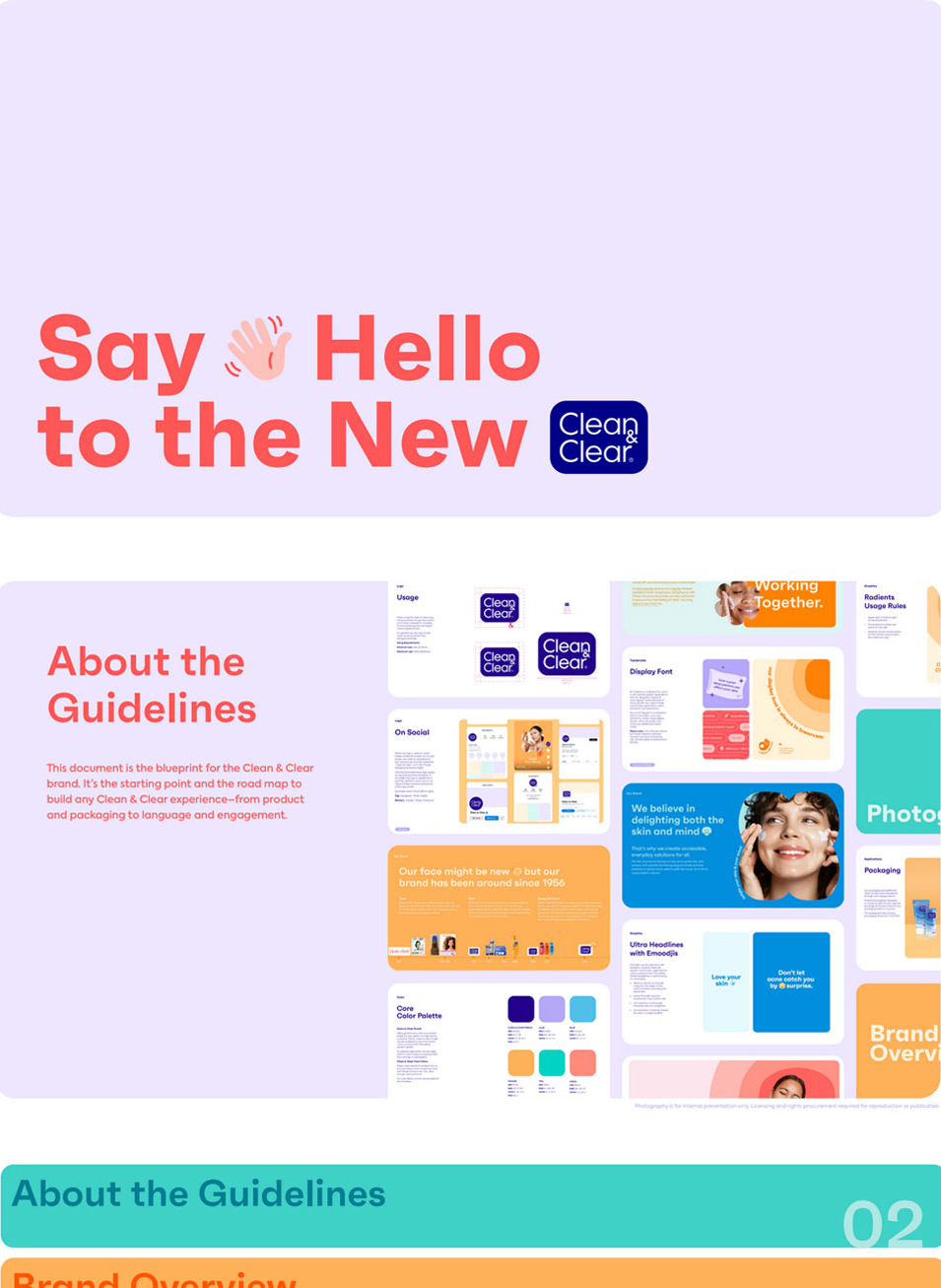
Keepin’ Up with the Next Gen 
While Clean & Clear’s efficacious acne and oil-fighting formulas have changed very little since its inception in the 1950’s, it was clear (no pun intended) that the brand needed a makeover when it came to approaching audiences of this era. Rather than splashy gimmicks and skin-scare tactics, we knew today’s discerning teens needed to be approached with character and honesty. The tonality and voice used across all brand communications today stay true to this approach that is reflected in the Style Guide that I built from scratch.

CleanandClear Home

The More You Know:

Although it’s been a staple of the Johnson & Johnson skincare portfolio since 1991, Clean & Clear was actually established by Revlon in 1957 and was a pioneer in introducing oil-free skincare products.

Clean & Clear Brand Guidelines

Let’s work together